Why Histograms?
Blog posts are not updated after publication. This post is more than a year old, so its content may be outdated, and some links may be invalid. Cross-verify any information before relying on it.
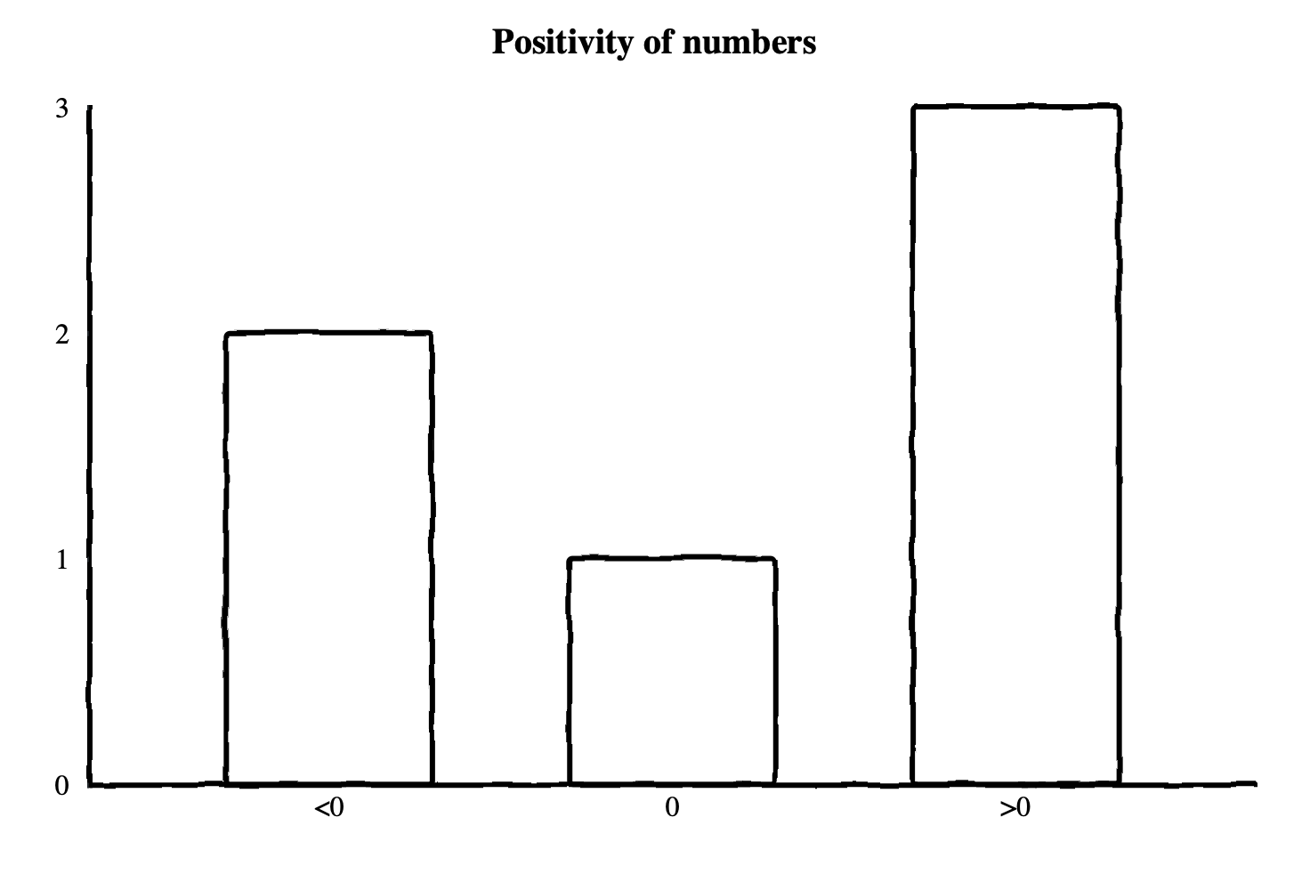
A histogram is a multi-value counter that summarizes the distribution of data
points. For example, a histogram may have 3 counters which count the occurrences
of negative, positive, and zero values respectively. Given a series of numbers,
3, -9, 7, 6, 0, and -1, the histogram would count 2 negative, 1
zero, and 3 positive values. A single histogram data point is most commonly
represented as a bar chart.

The above example has only 3 possible output values, but it is common to have many more in a single histogram. A real-world application typically exports a histogram every minute that summarizes a metric for the previous minute. By using histograms this way, you can study how the distribution of your data changes over time.
What are histograms for?
There are many uses for histograms, but their power comes from the ability to
efficiently answer queries about the distribution of your data. These queries
most commonly come in some form like “what was the median response time in the
last minute?” These are known as φ-quantiles, and often are abbreviated in a
shorthand like p50 for the 50th percentile or 0.5-quantile, also known as the
median. More generally, the φ-quantile is the observation value that ranks at
number φ*N among the N observations.
Why are Histograms useful?
A common use-case for histograms in observability is defining service level objectives (SLOs). One example of such an SLO might be “>=99% of all queries should respond in less than 30ms,” or “90% of all page loads should become interactive within 100ms of first paint.”
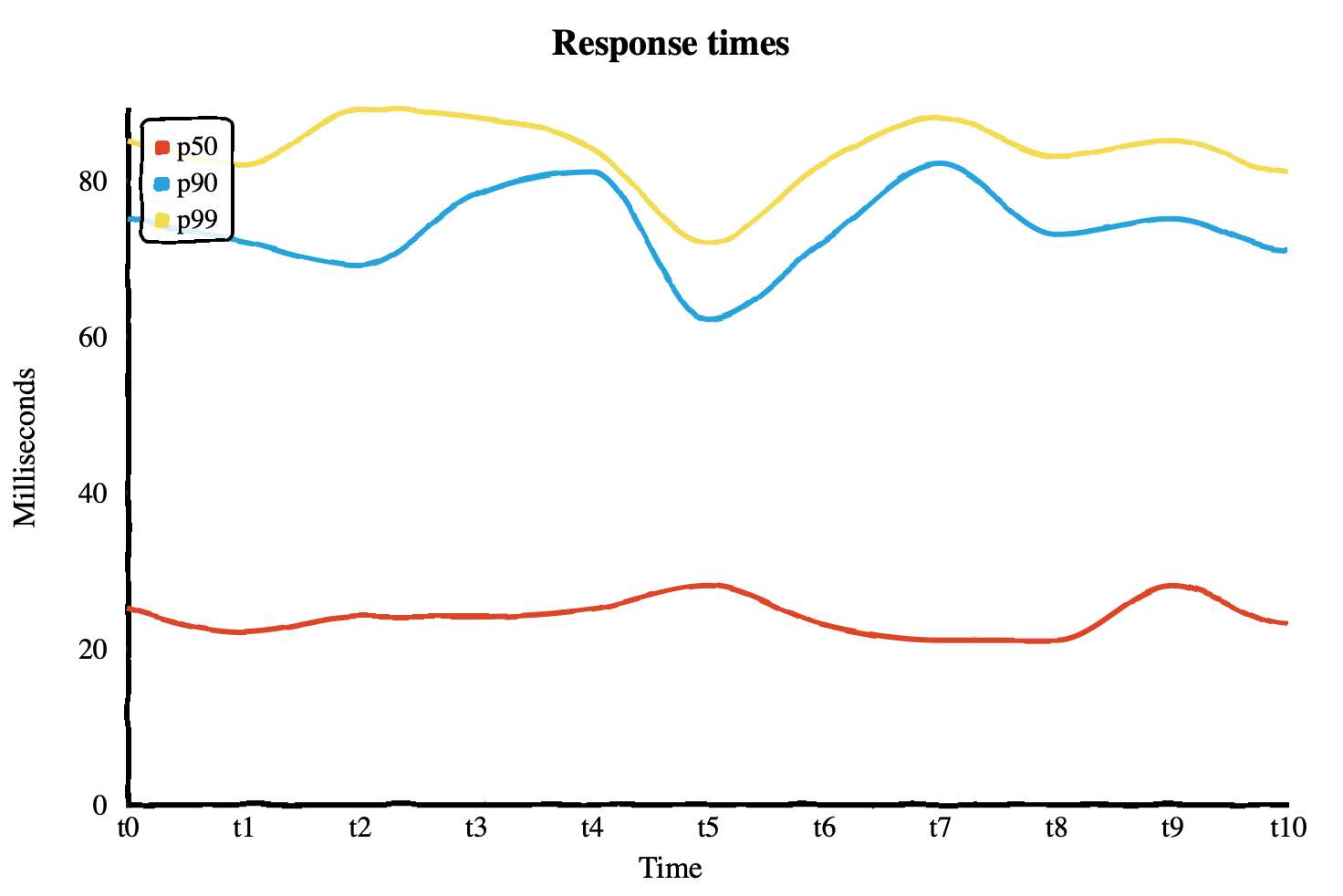
In the following chart, you can see the p50, p90, and p99 response times
plotted for some requests over some time. From the data, you can see that 50% of
requests are served in around 20-30ms or less, 90% of requests are served in
under about 80ms, and 99% of requests are served in under around 90ms. You can
very quickly see that at least 50% of your users are receiving very fast
response times, but almost all of your users are experiencing response times
under 90ms.

Other metric types
What if you’re already defining SLOs based on other metrics? You may have considered defining the SLOs to be based on gauges or counters. This approach can work, but it requires defining your SLOs before understanding your data distribution and requires non-trivial implementation at collection time. It is also inflexible; if you decide to change your SLO from 90% of requests to 99% of requests, you have to make and release code changes, then wait for the old data to age out and the new metric to collect enough data to make useful queries. Because histograms model data as a distribution from start to finish, they enable you to simply change your queries and get answers on the data you’ve already collected. Particularly with exponential histograms, arbitrary distribution queries can be made with very low relative error rates and minimal resource consumption on both the client and the analysis backend.
The inflexibility of not using histograms for SLOs also impacts your ability to
gauge impact when your SLO is violated. For example, imagine you are collecting
a gauge that calculates the p99 of some metric and you define an SLO based on
it. When your SLO is violated and an alert is triggered, how do you know it is
really only affecting 1% of queries, 10%, or 50%? A histogram allows you to
answer that question by querying the percentiles you’re interested in.
Another option is to collect each quantile you’re interested in as a gauge. Some
systems, like Prometheus, support this natively using a metric type sometimes
called a summary. Summaries can work, but they suffer the same inflexibility as
gauges and counters, requiring you to decide ahead of time which quantiles to
collect. They also cannot be aggregated, meaning that a p90 cannot be
accurately calculated from two separate hosts each reporting their own p90.
Other data sources and metric types
You may ask, “why would I report a separate metric rather than calculating it from my existing log and trace data?” While it is true that for some use cases, like response times, this may be possible, it is not necessarily possible for all use cases. Even when quantiles can be calculated from existing data, you may run into other problems. You need to be sure your observability backend is able to query and analyze a large amount of existing data on-line or index and analyze it at ingestion time. If you are sampling your logs and traces or employing a data retention policy that ages data out, you need to be sure those things are not affecting derived metrics, or that they are properly re-weighted, or you risk not being able to accurately asses your SLOs. Depending on your sampling strategy, it may not even be possible. Using histograms is a way to avoid these subtle problems if they apply to you.
A version of this article was originally posted to the author’s blog.